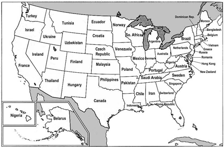
The creator of this map has had the interesting idea to break down that gigantic US GDP into the GDPs of individual states, and compare those to other countries’ GDP. What follows, is this slightly misleading map – misleading, because the economies both of the US states and of the countries they are compared with are not weighted for their respective populations.Â