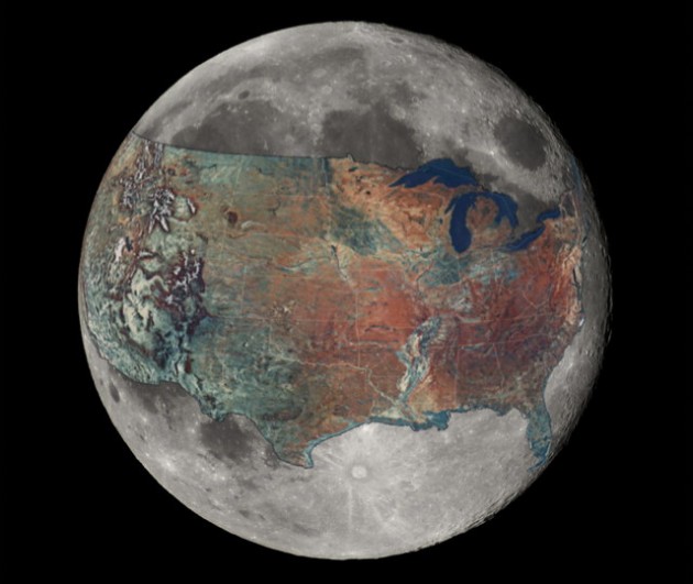
It was difficult for me to fathom the size of the moon, thus inspiring the creation of this map. For me, this map puts the scale of the moon much smaller than I previously imagined. But it’s really interesting hearing how others (already grasping the size of the moon) now see the US as larger. [Ed.: ‘MURICA, amirite?]
It was one definitely a weird challenge to take a “flat” map of something on a sphere and project it onto a smaller sphere. Certainly take it only as an approximation, but what intrigued me the most is that the distance spanning the continental United States is roughly equal to a little less than half the circumference of the moon.
Wow, I seriously over estimated the size of the moon.