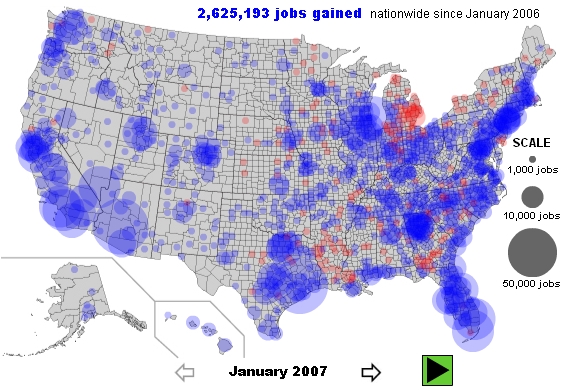
Using the Labor Department’s local area unemployment statistics, Slate presents the recession as told by unemployment numbers for each county in America. Because the data are not seasonally adjusted for natural employment cycles throughout the year, the numbers you see show the change in the number of people employed compared with the same month in the previous year. Blue dots represent a net increase in jobs, while red dots indicate a decrease. The larger the dot, the greater the number of jobs gained or lost.
Check out the interactive map here, but below are the first and last months.

