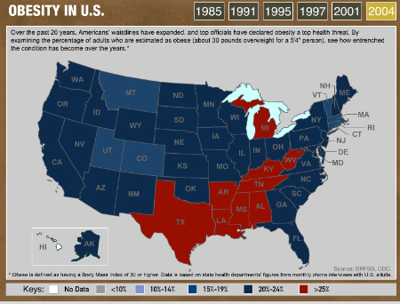
Interactive U.S. Obesity Map It takes you from 1985 to 2004. Quite amazing. From my first observation, it appears that Mississippi lead the trend. Link This entry was posted in Uncategorized. Bookmark the permalink.
so do i move back to TEXAS?