We all know what the world looks like. But a new series of extraordinary maps shows our planet in a very different light. Rather than defining each country by size, these computer-generated modified maps – or cartograms – redraw the globe with each country’s size proportionate to its strengths, or weaknesses, in a whole series of categories.
The cartograms were produced in a unique collaboration between the universities of Michigan in the U.S. and Sheffield. Here are images and more details on some of the most fascinating…
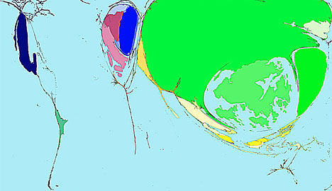
Military Spending
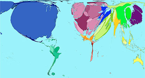
War and Death
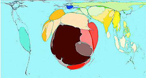
Toy Imports
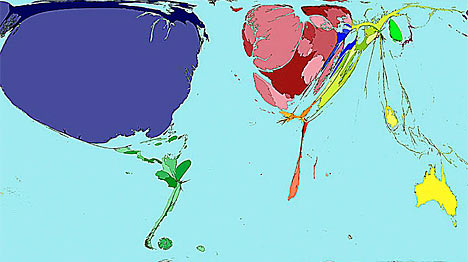
Toy Exports